Mortal Kombat HD Remix with MUGEN

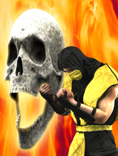
Here is the 3D skull to finish your composite.

Superb! Here's what I got.
SCOR_ENDING_TORMENT(OLD).jpg SCOR_ENDING_TORMENT.jpg


Or we can get even crazier and give it depth of field, whereas the main focal point can be either Scorpion or maybe that part of the story is more related to the skull? I don't know, I'm silly and need sleep.

SCOR_ENDING_TORMENT(ScorpBlur).jpg SCOR_ENDING_TORMENT(SkullBlur).jpg

What do you think?

Great work you guys.
 
Last edited:
nice work MrMos3s......how about this for background?

Fire_B.jpg


and of course you are better than me in photoshop, but here's my work.

MK_Scorpion_Ending.jpg
 
Sorry DFGHTENNIS I like MrMos3s's fire a bit better. As for the depth of field I'm torn between the one where the skull is slightly out of focus and the one where everything is in focus without DOF. But in the end my eye keeps going to the one without the DOF.

I don't like the version where Scorp is out of focus. From a visual weight perspective, I feel Scorps coloring, size and position in the composition screams for the viewer to pay attention to him yet when he's out of focus there is no payoff. Do you agree?

BTW: this looks fantastic to me.

@ttas: I think that is the Super NES version? Something doesn't look right to me outside of the Power bars.
 
Last edited by a moderator:
nice work MrMos3s......how about this for background?

Fire_B.jpg


and of course you are better than me in photoshop, but here's my work.

MK_Scorpion_Ending.jpg

Your rendition is great man! The position of the Skull is exactly same as the original, then the background kinda needs black/dark edges. What I don't like is you tweaked Scorpion's color. .
 
This is awesome. Loving it, cant wait to play it either. I prime of example here also how the thanks button is abused for stupid thinks. Guys in this thread involved with this project are actually posting useful posts and interesting stuff, not hipster wigger humour.

I am so impressed with this thread, its a shame Boon and his team dont pick this up and distribute on PSN Xbox live so you reap some profit from it.
 
You did an awesome work, and the guy who made the skull needs to work in a video game industry ;D..
love your work guys...keep up :D

Thanks for the compliment but believe me, I've got lots to learn before working in the video game industry. Bleed on the other hand, I can't believe he doesn't have a job in games.

You know what after further consideration I think I do like the 4th one that DFGHTENNIS pointed out. It looks cool with the skull in depth of field. Can we call that one the final one?


Superb! Here's what I got.
View attachment 3728 View attachment 3729


Or we can get even crazier and give it depth of field, whereas the main focal point can be either Scorpion or maybe that part of the story is more related to the skull? I don't know, I'm silly and need sleep.

View attachment 3730 View attachment 3731

What do you think?

Great work you guys.
 
Last edited by a moderator:
I just tried to do something (with DFGHTENNIS background blend with a red/yellow blurry clouds) with almost the same color the game has. It's maybe a little to flashy, I don't know...

scorp3.jpg scorp2.jpg
 
Thanks for the compliment but believe me, I've got lots to learn before working in the video game industry. Bleed on the other hand, I can't believe he doesn't have a job in games.
|||||||||||||||||||||You know what after further consideration I think I do like the 4th one that DFGHTENNIS pointed out. It looks cool with the skull in depth of field. Can we call that one the final one?

Reply 1:Calactyte, you and bleed are both artists, thats right what you said, you have lots of things to learn before working in the video game industry, but you are getting closer each day

Reply2:In my opinion thats the final one, i like the one that cb0363 made, but the 4th is realy cool :D
 
Your rendition is great man! The position of the Skull is exactly same as the original, then the background kinda needs black/dark edges. What I don't like is you tweaked Scorpion's color. .

The end of Scorpion!!!
the only thing i have to say: Perfect!
ops sorry: Flawless Victory
 
Last edited by a moderator:
Ok Bleed it is up there named: MK1_Subzero_portrait.max

Hope you can fix his eyes and twisted thumb (good catch interloko)

You do re-save it back up there remember to save down to 3ds max 2010 again.
 
Yeah, his eyes should obviously be fixed.
Mess with the fingers a bit, and maybe move his hand closer
to his right shoulder, so the left shoulder (vest) is more visible.

2r5gcgy.png
300bdlg.png


Btw, looks great.. love the cloth texture.
 
Top